This is the Real Care Pathways main logo for their Care business.
www.realcarepathways.co.uk
www.realcarepathways.co.uk
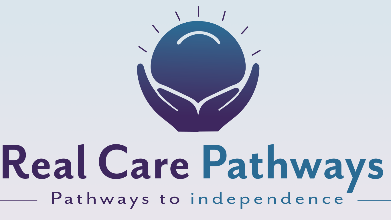
The logo was designed with "care" in mind as business is the caring industry that is looking after 16+ in need of care. Thus for the logo of the brand i wanted something that showed a caring element in the design, a soft appeal and an iconic aspect that showed class for the brand identity of the caring business.
I went with "Mr Eaves San OT for the word mark as i felt this best suited the brand with the caring curves to the text.. The logo mark itself is iconic the design of two hands in a holding he sun shows the elements of "care" and the sun represents bright and warmth from the company,along with the owner wanting a sun element in the design as it is part of his country.
I went with "Mr Eaves San OT for the word mark as i felt this best suited the brand with the caring curves to the text.. The logo mark itself is iconic the design of two hands in a holding he sun shows the elements of "care" and the sun represents bright and warmth from the company,along with the owner wanting a sun element in the design as it is part of his country.
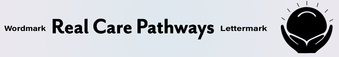
Below shows the seperation of the logo in it's main Wordmark title and the lettermark
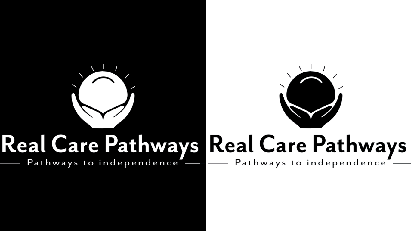
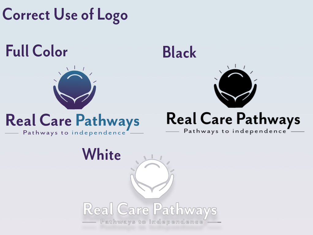
Here represents the logo without color, which will be applied to documents such as, envelopes, stamps.
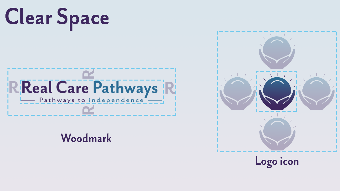
Clear Space: It is critical to maintain an open area surrounding the logo so it remains recognisable and does not become lost in other page elements. Clear space is defined relative to the size of the logo, not as a border of a set distance, in this case, we use the hieght of the letter "r" to show this spacing. In the logo mark you use the whole icon to show it's needed clear space for its element.
Thus the use of the logo is very important for a brand as it needs specific uses to keep consistent with it's brand identities.
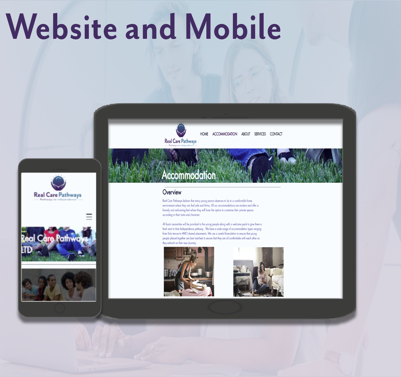
Making sure the website that has been created for the business is suited for Mobile and iPad use for the ease of customers to use is very important. Below shows the main page and Accommodation page and how it looks on the phone and iPad.
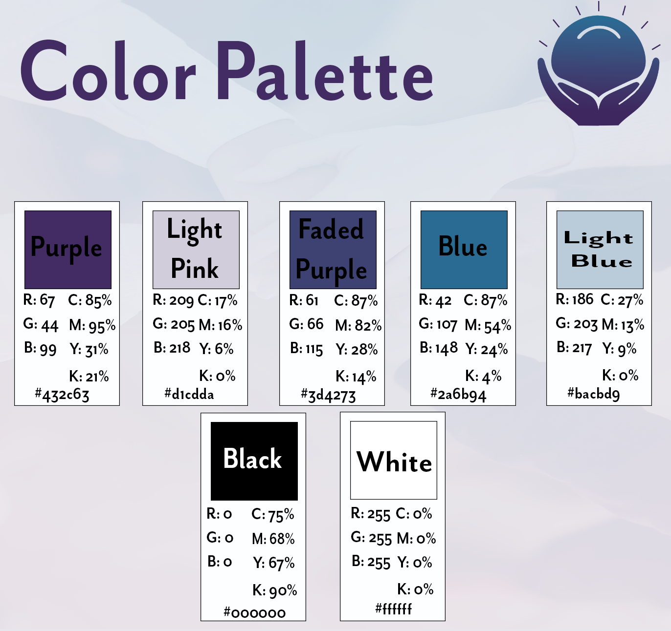
Colour palette:
These are the brand colours for Real Care Pathways, they compliment the brand style of stylistic and quality that the brand is going for, with the variations of Purple to Blue, with the white backgrounds
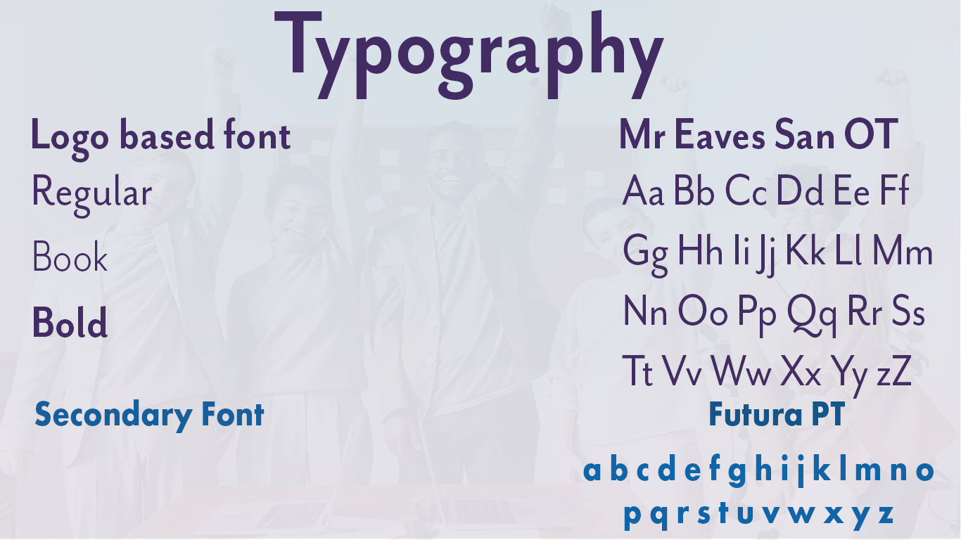
Typography:
The base font the logo design was Mr Eaves San OT Bold.
Second Base Font is Futura PT, as it complimented the logo type face very well. Thus FuturaPT is used on the website as the main font style, using Bold Medium and Light throughout the pages, documents such as letter heads and on the Business cards the main font of Mr Eaves San OT is used.
Second Base Font is Futura PT, as it complimented the logo type face very well. Thus FuturaPT is used on the website as the main font style, using Bold Medium and Light throughout the pages, documents such as letter heads and on the Business cards the main font of Mr Eaves San OT is used.
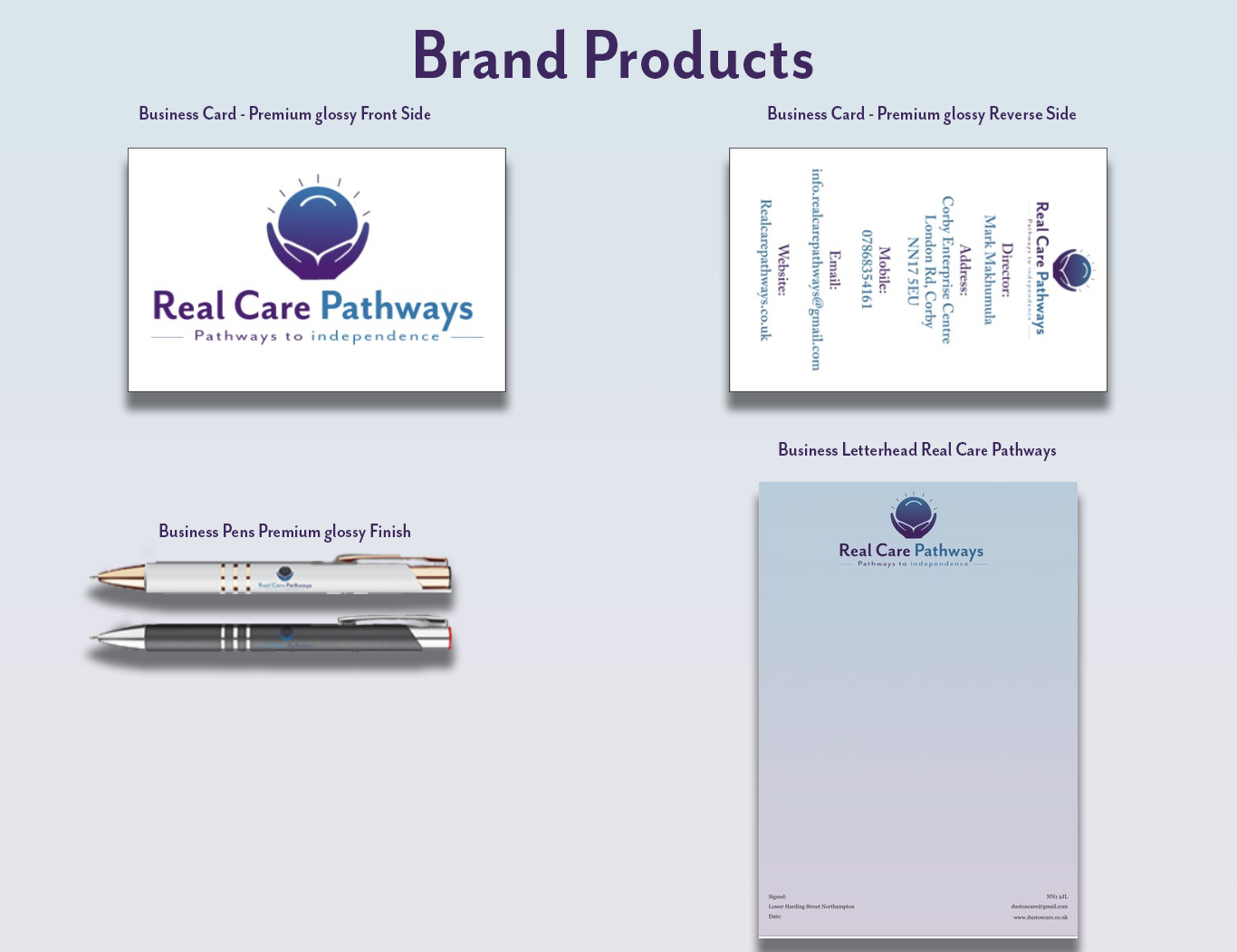
Brand Products such as Business Cards, pens and letterheads have been used for the client in the setting up of their office. Below is the items featured.
Brand Designer: Mitchell Lawrence, ML-Designs
This is for a real life business in the care industry in the United Kingdom, Real Care Pathways
If you liked the work, please appreciate it!
mitchelllawrencedesigns@gmail.com
This is for a real life business in the care industry in the United Kingdom, Real Care Pathways
If you liked the work, please appreciate it!
mitchelllawrencedesigns@gmail.com