
Foodechi is brand idea for a fine dining Italian Restaurant brand, that offers an exquisit dining experience. It sources local Italian produce and makes everything fresh, to provide the customer with the finest food Italy has to offer. It is a restaurant marketed targetted to an audience of 35 to 70-year-olds, middle to high class and for all genders
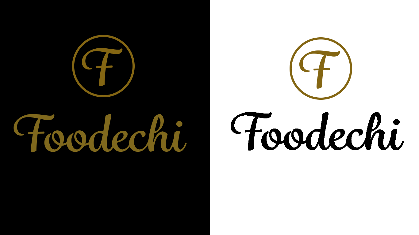
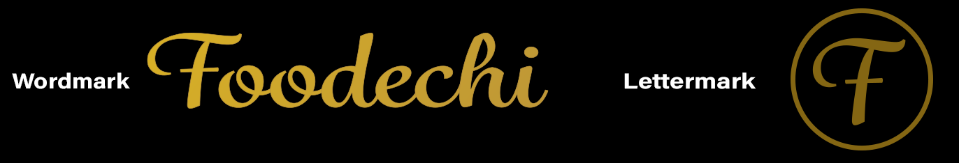
For the logo of the brand i wanted something that felt stylish but modern, that showed class for the brand identity of the restaurant. I went with Grafolita Script for the word mark as i felt this best suited the brand. The letter mark is the first initial of the brand, "F". Using the first letter of the brand name helps people identify where the F is from and keeps it simple. The circle helps make the F stand out more and the lettermark itself is iconic.
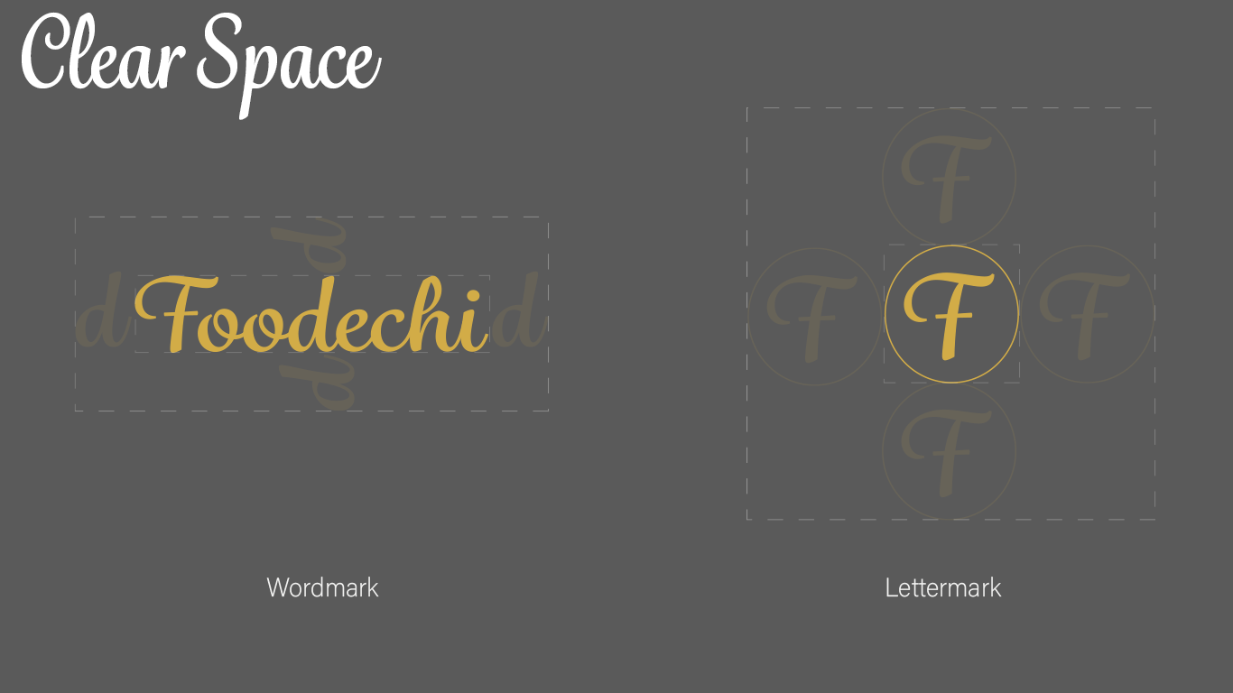
Clear Space: It is critical to maintain an open area surrounding the logo so it remains recognisable and does not become lost in other page elements. Clear space is defined relative to the size of the logo, not as a border of a set distance, in this case, we use the hieght of the letter "d" to show this spacing. In the lettermark you use the whole icon to show it's needed clear space for its element
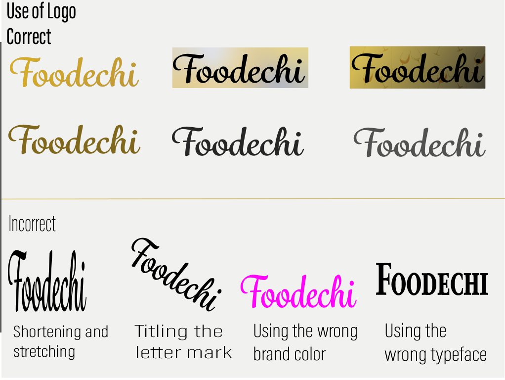
Thus the use of the logo is very important for a brand as it needs specific uses to keep consistent with it's brand identities. Below show the correct and incorrect uses of the logo, that states what should be done with the logo.
This is a brand pattern developed using the logo mark "F" as a pattern, with a 4 way gradient overlay of brand colors to produce a Menu style cover for the restaurant.

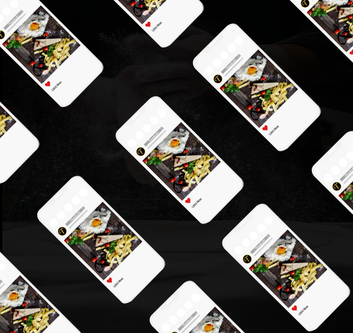
Social media posts example with Instagram. The fresh food used to make dishes for the restaurant with the logo wordmark over the image to show the customer where they can find a restaurant that uses local produce. The logo lettermark is used for the Instagram profile image, keeping with brand identity,
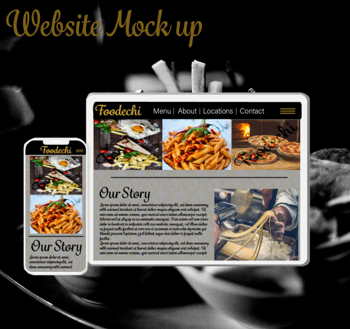
Website mock up for Foodechi:
The below images potray how the website would look on a iPad screen and iPhone screen respectively. Keeping with brand identity, the site uses the correct color palette, logo placed on images used on site and the two type faces used with-in the brand. Grafolita Script and Acumin Variable Font.
It also using the logo lettermark as a background for the website, everything about the site potrays the brand their idea.
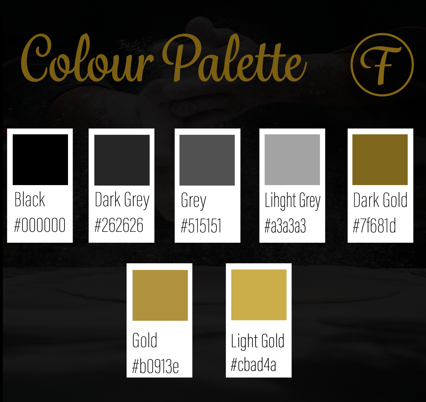
Colour palette:
These are the brand colours for Foodechi, they compliment the brand style of stylistic and quality that the brand is going for, with the variations of gold on black and grey items with-in the brand.
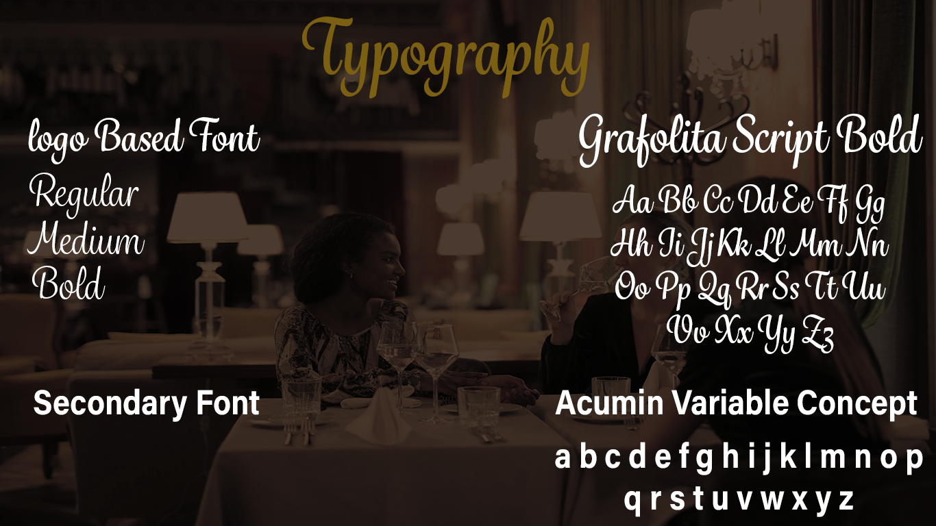
Typography:
The base font the logo design was Grafolita Script.
Second Base Font is Acumin Variable Concept, as it complimented the logo type face very well. Thus this logo type face would be used with the brand elements when paired with the logo such as on Menus, Website, clothing etc.
Second Base Font is Acumin Variable Concept, as it complimented the logo type face very well. Thus this logo type face would be used with the brand elements when paired with the logo such as on Menus, Website, clothing etc.
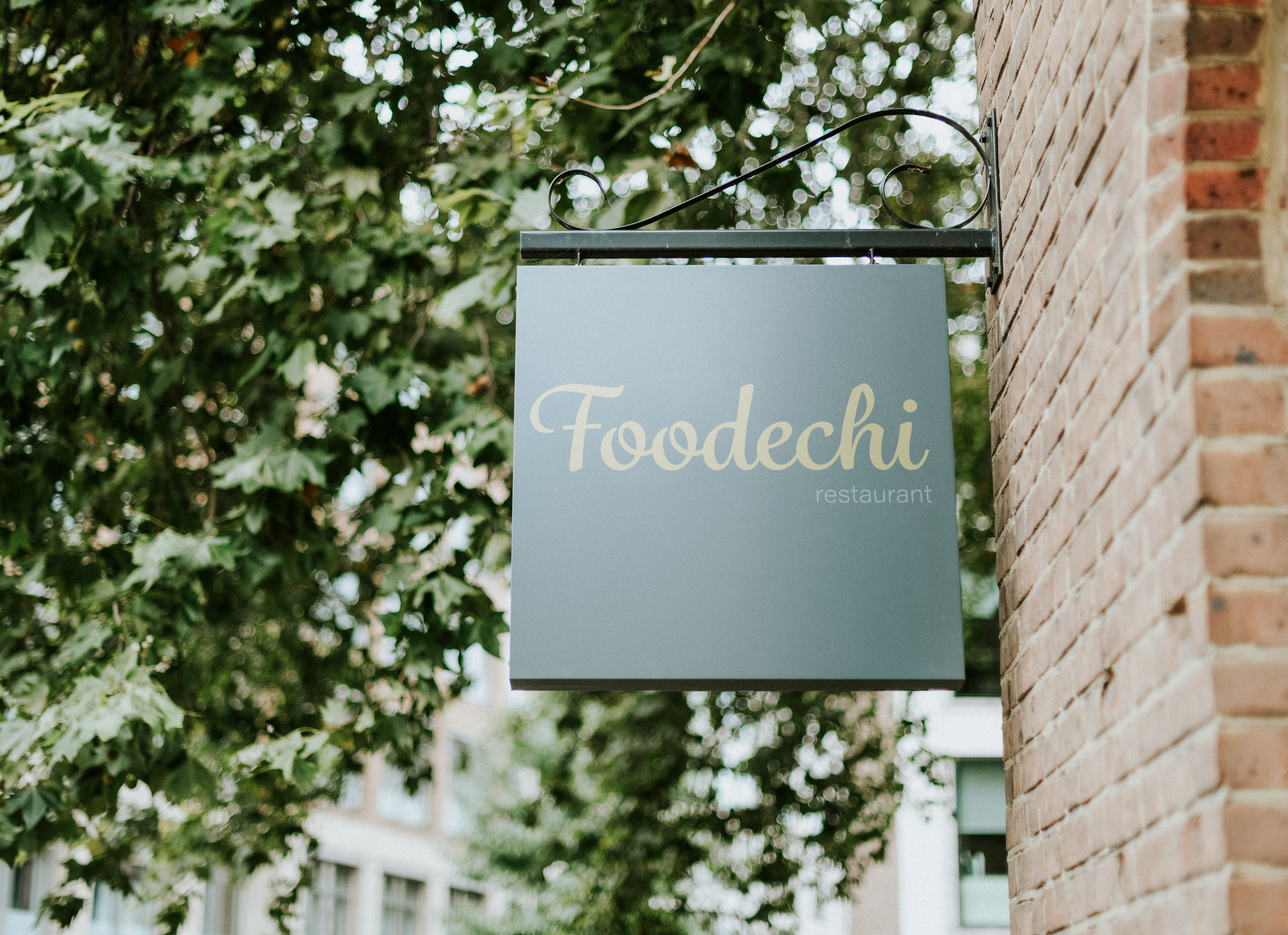
Sign Mock Up: To show how the logo type face can be used on a shop sign.
Bag created in Adobe Dimension

Brand Designer: Mitchell Lawrence, ML-Designs
External photos used by Pexels.com ; Malidate Van, Splitshire, Adrienn & Andrea Piacquadio
Mock up sign by <a href="https://www.freepik.com/free-photos-vectors/logo">Logo psd created by rawpixel.com - www.freepik.com</a>
Thank you for taking the time to look through this project. It was really fun to do, it was an Behance Adobe Illustrator challenge.
If you liked the work, please appreciate it!
mitchelllawrencedesigns@gmail.com