Duston Care
www.dustoncare.co.uk
www.dustoncare.co.uk
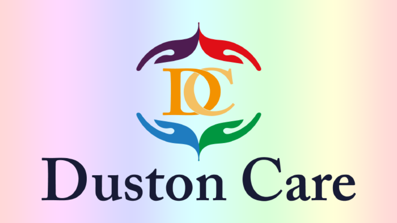
The logo was designed with "care" in mind as business is the caring industry that is looking after 16+ in need of care. Thus for the logo of the brand i wanted something that showed a caring element in the design, a soft appeal and an iconic aspect that showed class for the brand identity of the caring business.
I went with the Adobe Caslon Pro for the word mark as i felt this best suited the brand identity the client had. The logo mark itself is iconic the design of the four hands surrounding the lettermark of the "DC" to show the business has full care in mind for their clients. The business wanted a colorful aspect to the business logo to stand out from other business' in the industry, thus the bright colors show a joyful aspect along with care. Two aspects the business wants to highlight.
I went with the Adobe Caslon Pro for the word mark as i felt this best suited the brand identity the client had. The logo mark itself is iconic the design of the four hands surrounding the lettermark of the "DC" to show the business has full care in mind for their clients. The business wanted a colorful aspect to the business logo to stand out from other business' in the industry, thus the bright colors show a joyful aspect along with care. Two aspects the business wants to highlight.
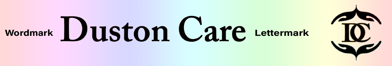
Below shows the seperation of the logo in it's main Wordmark title and the lettermark
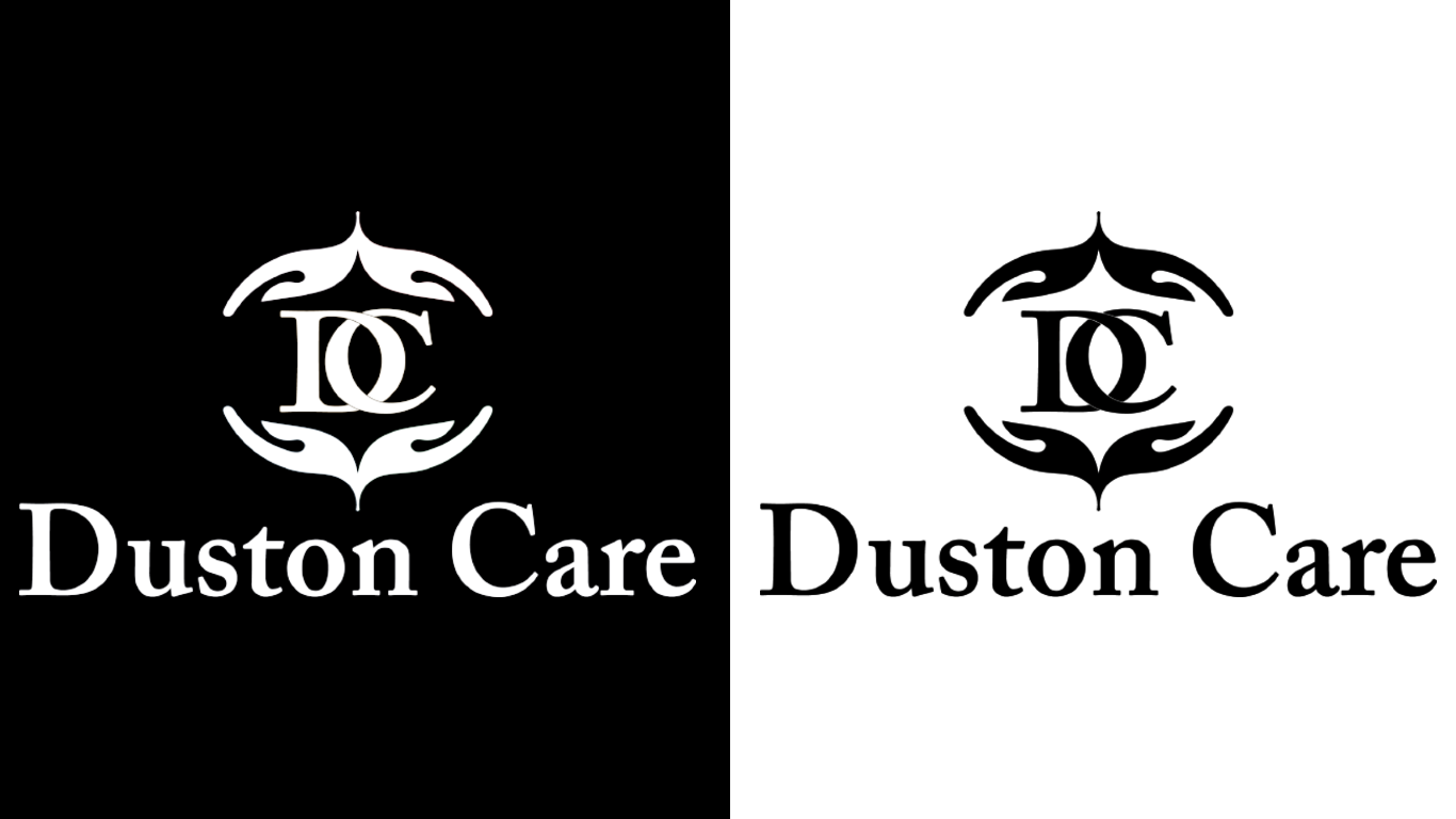
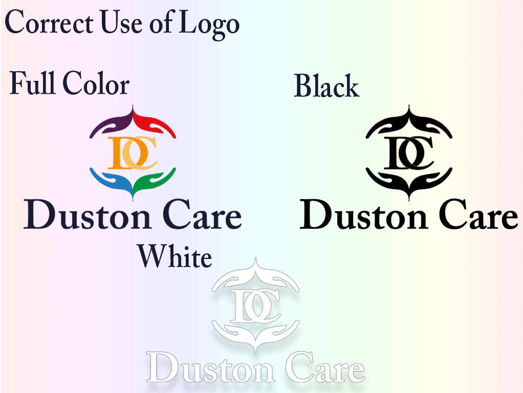
Here represents the logo without color, which will be applied to documents such as, envelopes, stamps.
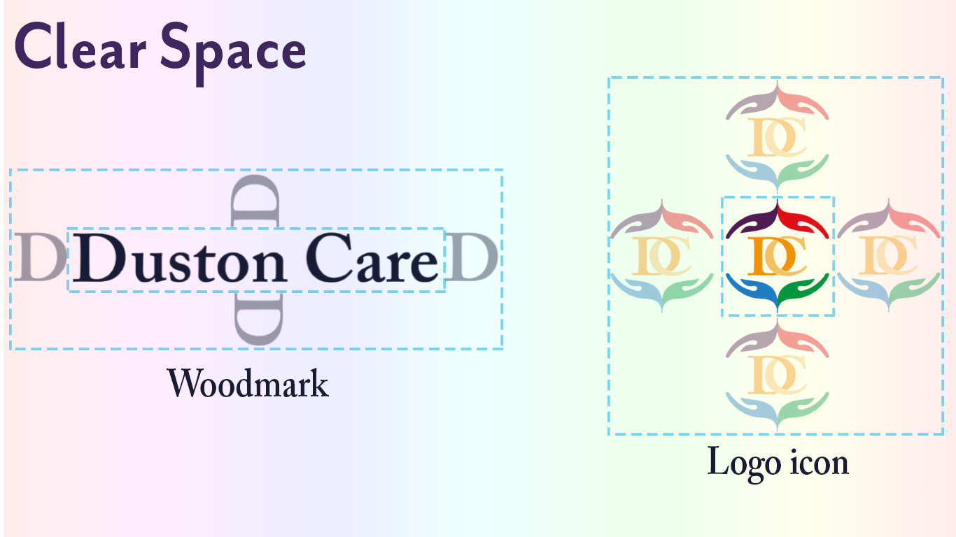
Clear Space: It is critical to maintain an open area surrounding the logo so it remains recognisable and does not become lost in other page elements. Clear space is defined relative to the size of the logo, not as a border of a set distance, in this case, we use the hieght of the letter "d" to show this spacing. In the logo mark you use the whole icon to show it's needed clear space for its element.
Thus the use of the logo is very important for a brand as it needs specific uses to keep consistent with it's brand identities.
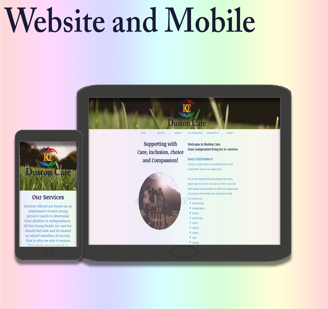
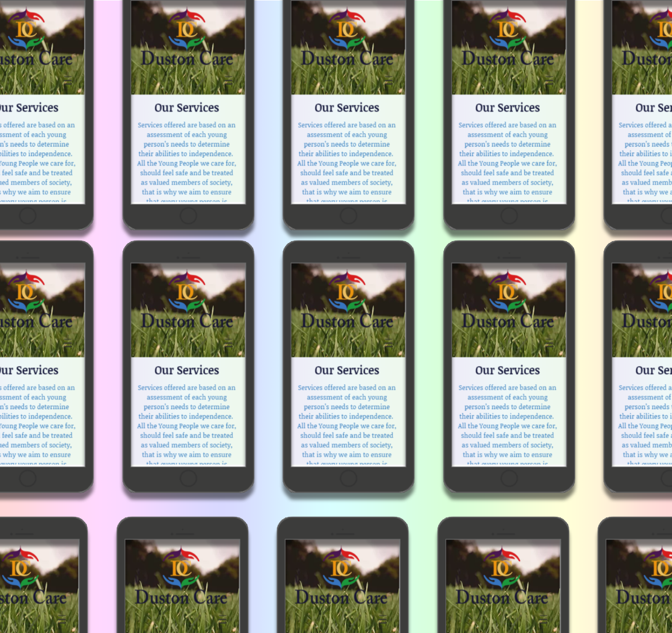
Making sure the website that has been created for the business is suited for Mobile and iPad use for the ease of customers to use is very important. Below shows the main page and Accommodation page and how it looks on the phone and iPad.
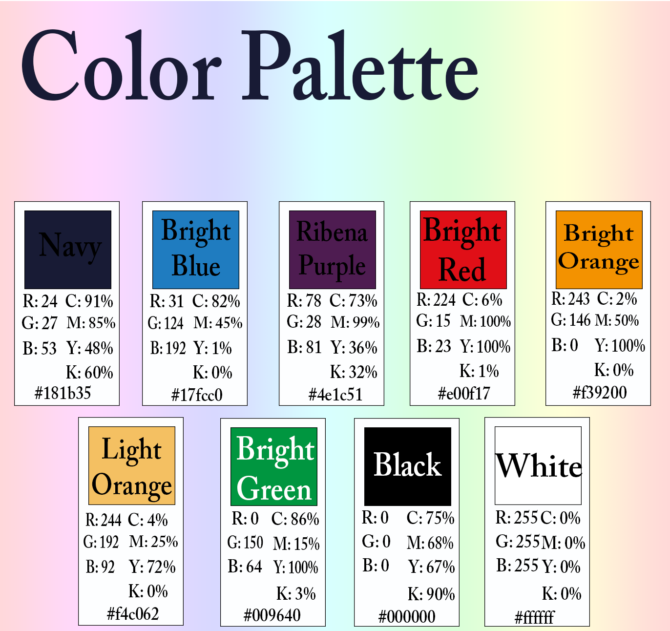
Colour palette:
These are the brand colours for Duston Care, the owner wanted a fun, vibrant and exciting colour palette to show the customer they are a friendly business and on of Joy. The pattern of the colours represents a rainbow pattern which helps makes information and pictures stand out with such a beautiful background.
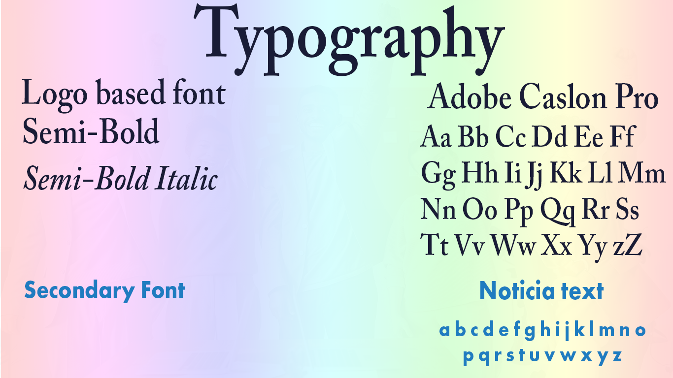
Typography:
The base font the logo design was Adobe Caslon Pro
Second Base Font is Noticia, as it complimented the logo type face very well. Thus Noticia is used on the website as the main font style, using Bold Medium and Light throughout the pages, documents such as letter heads and on the Business cards the main font of Adobe Caslon Pro is used.
Second Base Font is Noticia, as it complimented the logo type face very well. Thus Noticia is used on the website as the main font style, using Bold Medium and Light throughout the pages, documents such as letter heads and on the Business cards the main font of Adobe Caslon Pro is used.
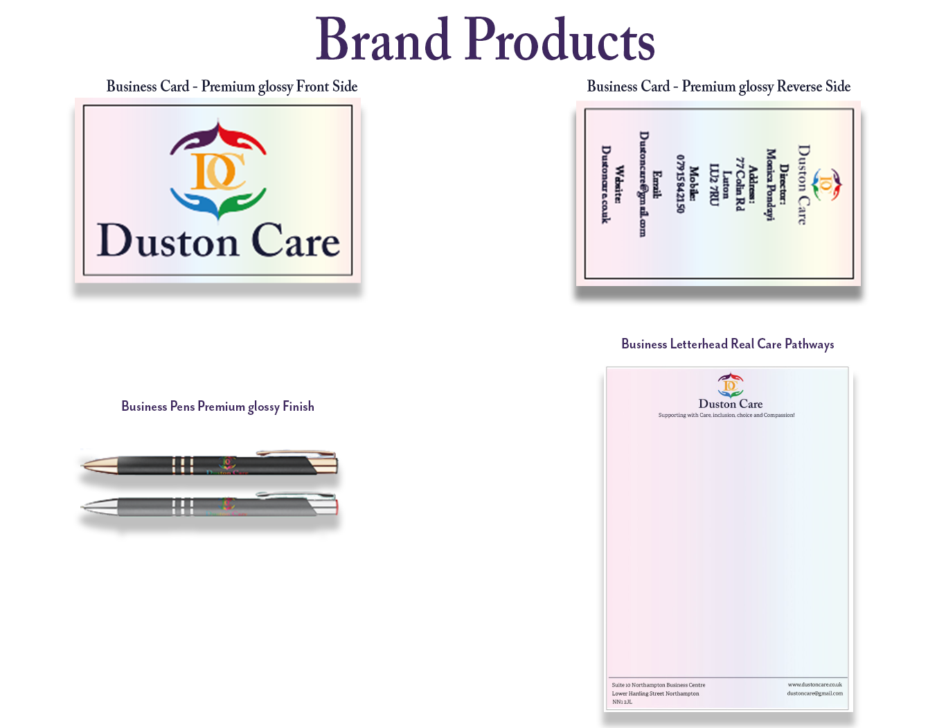
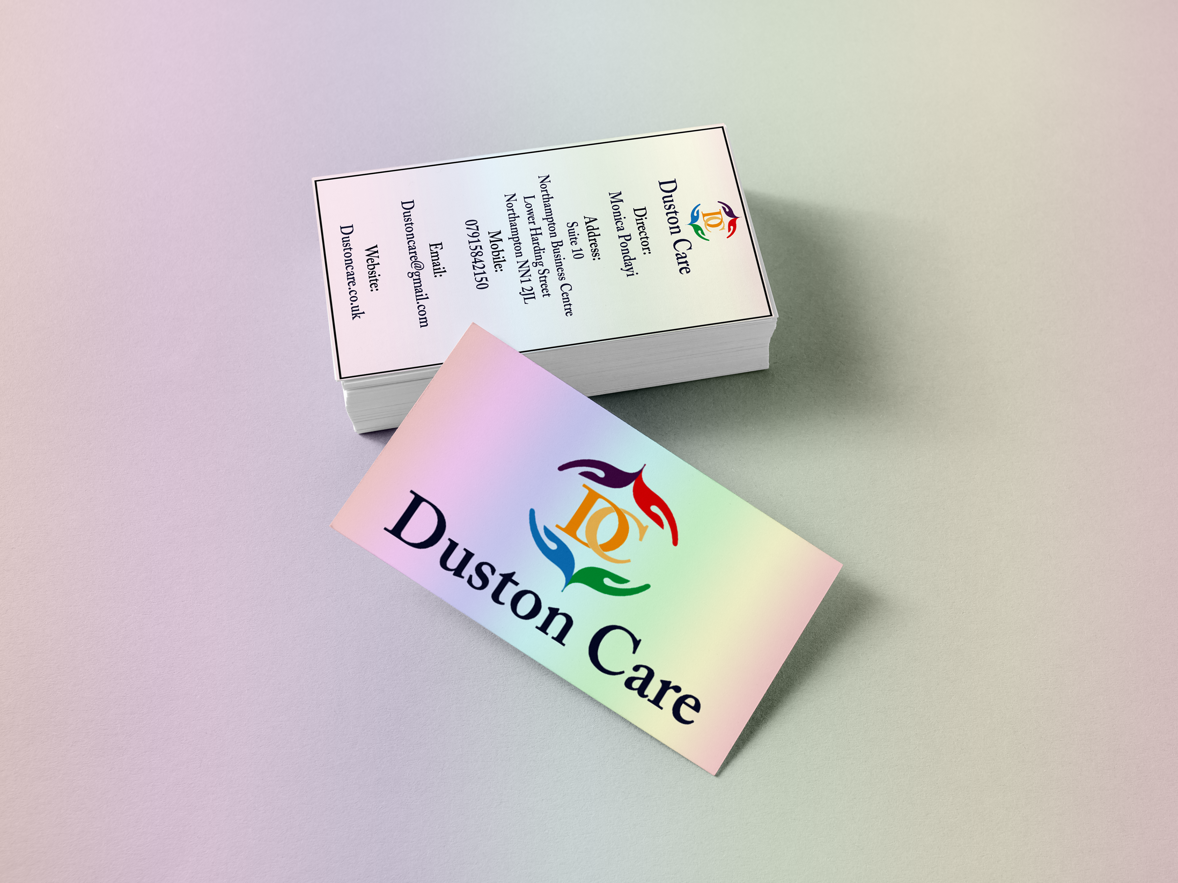
Brand Products such as Business Cards, pens and letterheads have been used for the client in the setting up of their office. Below is the items featured.
Brand Designer: Mitchell Lawrence, ML-Designs
This is for a real life business in the care industry in the United Kingdom, Duston Care
If you liked the work, please appreciate it!
mitchelllawrencedesigns@gmail.com
This is for a real life business in the care industry in the United Kingdom, Duston Care
If you liked the work, please appreciate it!
mitchelllawrencedesigns@gmail.com